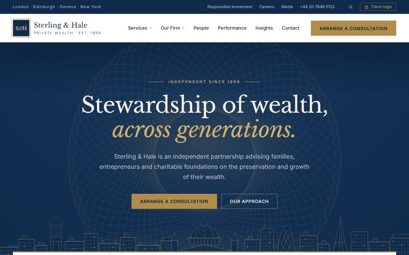
Corporate Classic
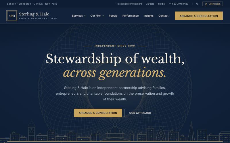
Navy, serif and quiet authority.
For law and accounting firms
- Navy, white and gold palette
- Serif headlines
- Structured, symmetrical grid
Open any card to see the full concept mockup. Mockups use fictional brands and show the direction of a style; your final website is designed from scratch for you. Found the one? Send its name through the contact form.
For organisations that have to earn trust before they earn a meeting: law firms, holding groups, consultancies, universities, clinics, telecoms and city services.
Navy, serif and quiet authority.
For law and accounting firms
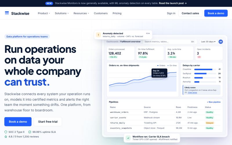
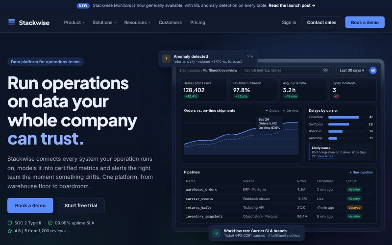
Clear, credible, built to convert.
For B2B software
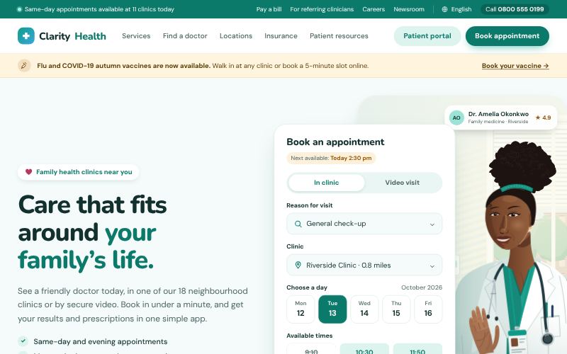
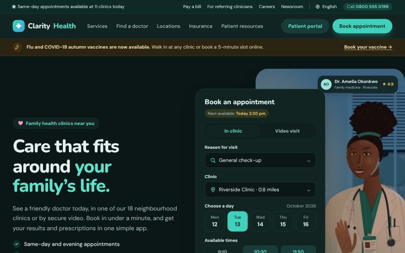
Calm, caring and clinically clear.
For clinics and hospitals
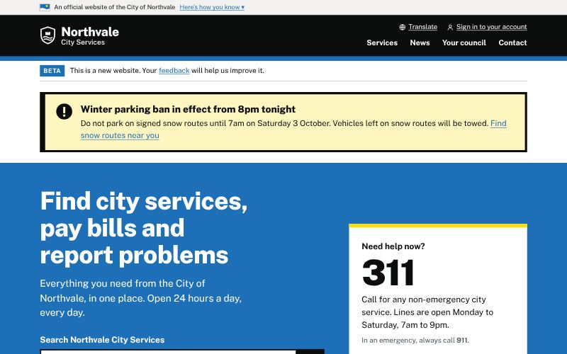
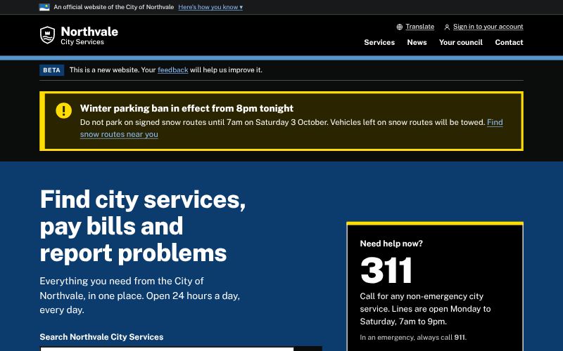
Plain, accessible, task-first.
For government and city services
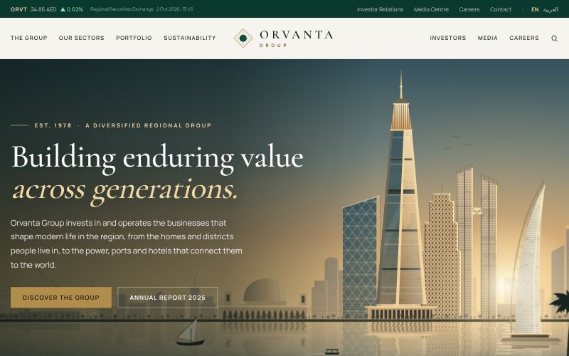
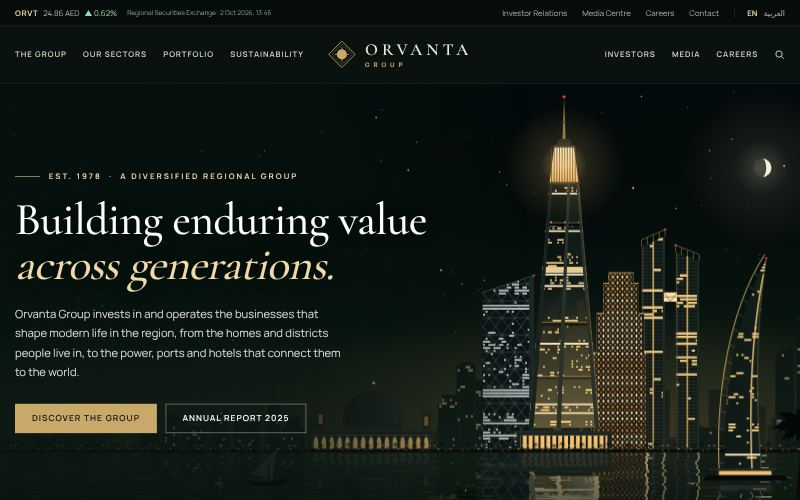
One group, many sectors, total composure.
For family and investment holdings
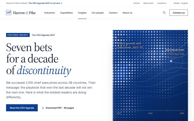
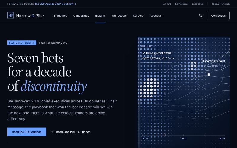
Insight-led, editorial and precise.
For consulting and advisory firms
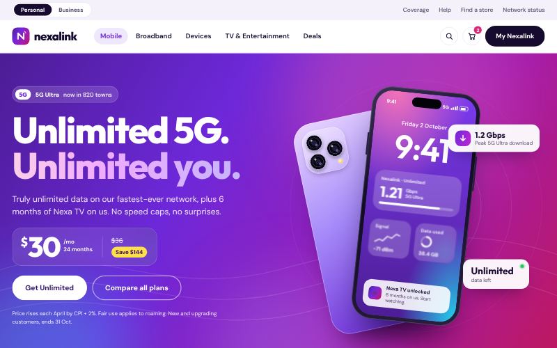
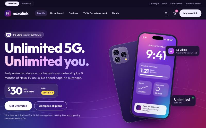
Bright, energetic and plan-focused.
For mobile and broadband operators
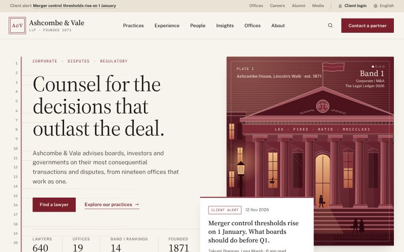
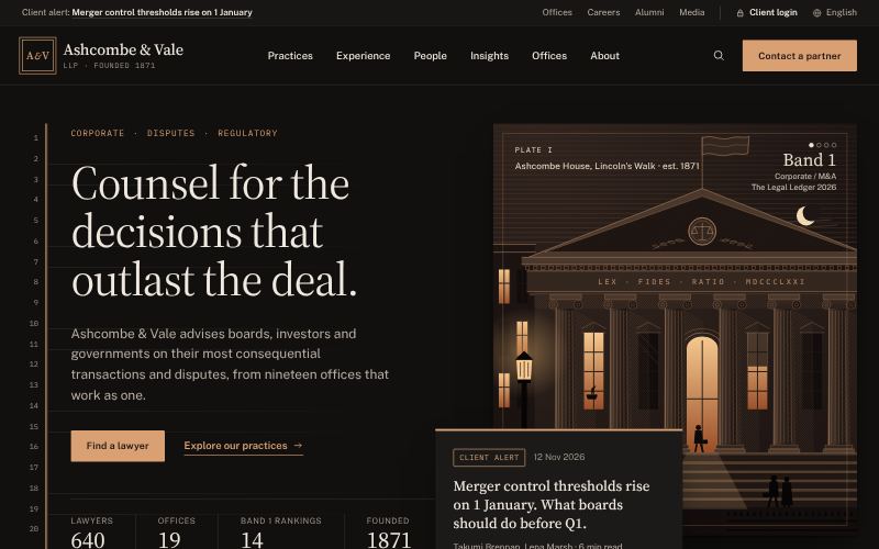
Measured, authoritative, discreet.
For law firms and chambers
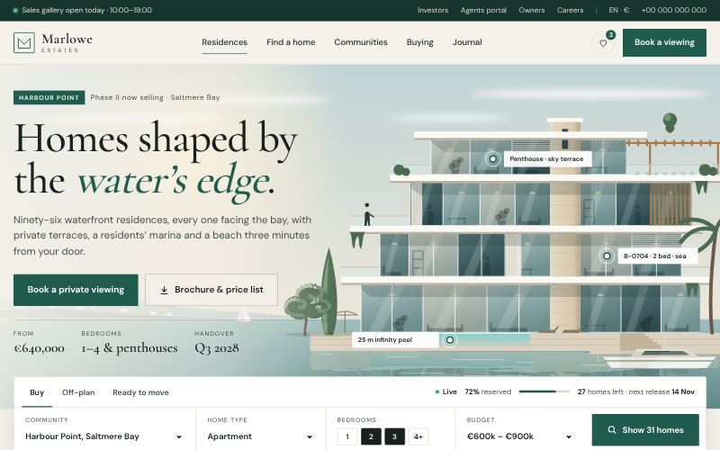
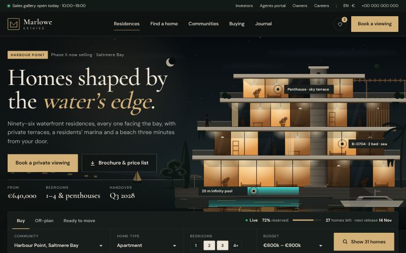
Architectural, aspirational, sales-ready.
For property developers
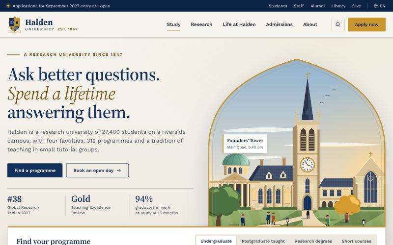
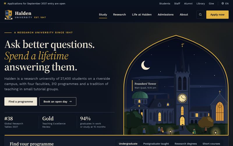
Heritage with an open door.
For universities and colleges
For licensed financial brands that must look secure and regulated from the first screen: retail, investment and Islamic banks, insurers, digital wallets and trading platforms.
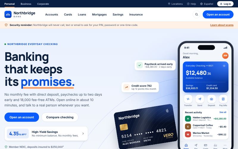
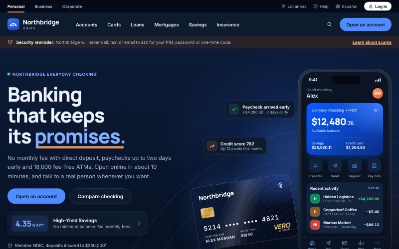
Clear products, real rates, total trust.
For retail and commercial banks
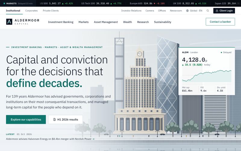
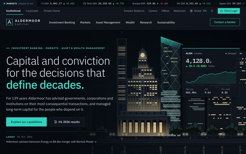
Data-dense, discreet and institutional.
For investment banks
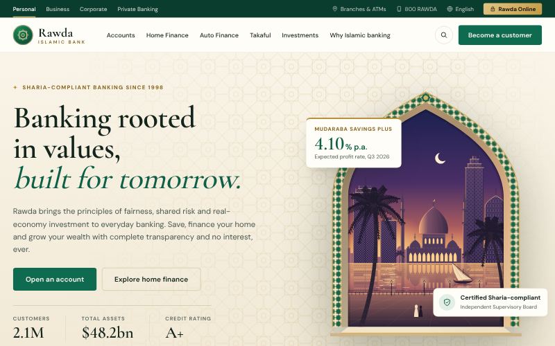
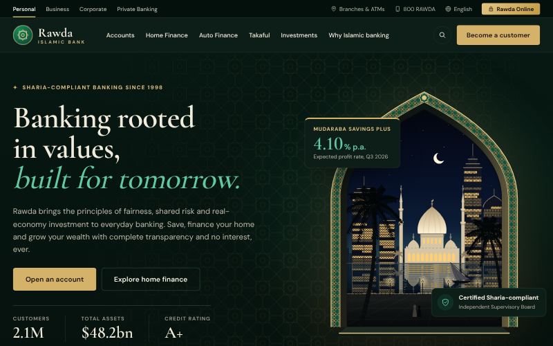
Geometric heritage, modern finance.
For Islamic banks and windows
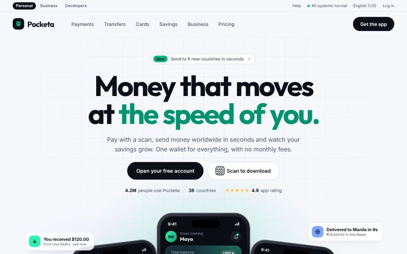
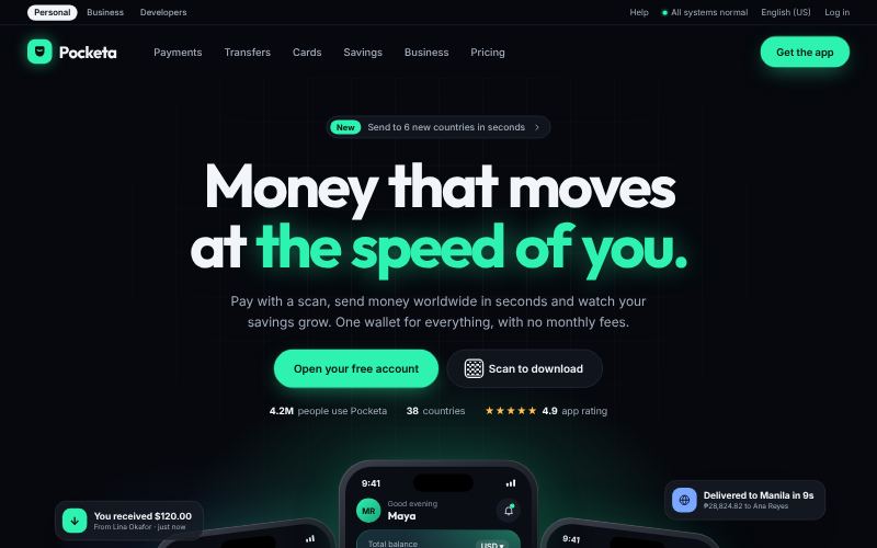
Mobile-first money, made delightful.
For digital wallets and neobanks
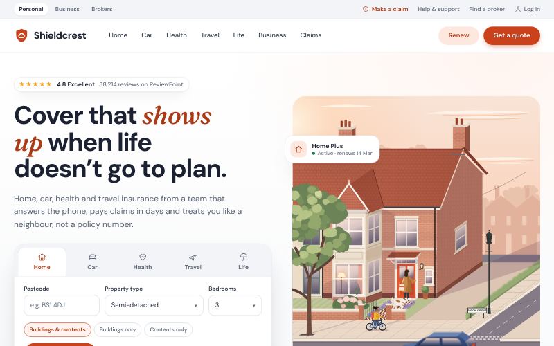
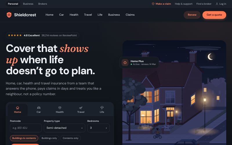
Reassuring, simple, human.
For insurers and takaful providers
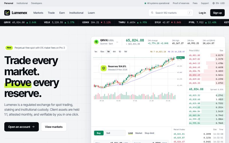
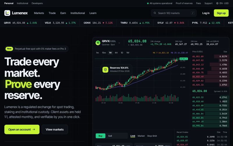
Live markets, dense data, dark by default.
For crypto exchanges and brokers
For operators of large physical assets who need to show scale, safety and delivery: oil and gas, utilities, EPC contractors, shipping lines and airlines.
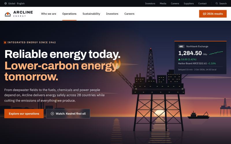
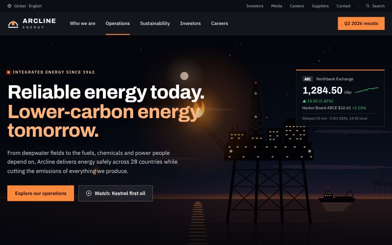
Industrial scale, safety-first precision.
For oil and gas companies
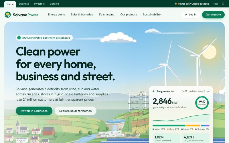
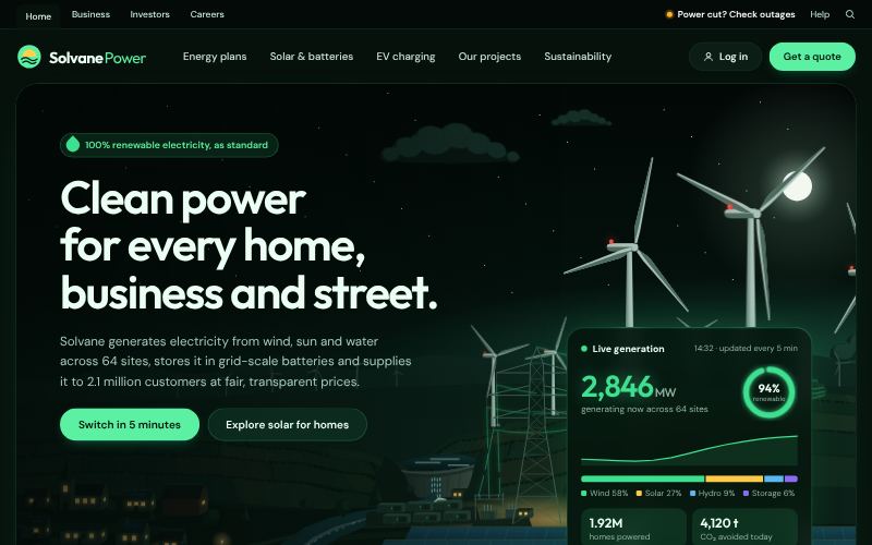
Clean, optimistic and data-driven.
For utilities and power companies
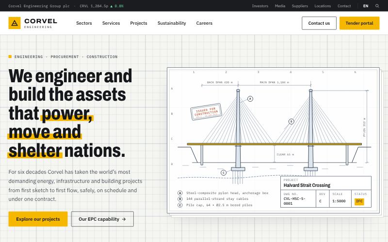
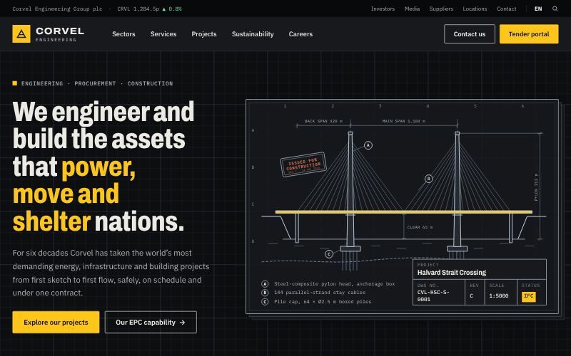
Built on precision, delivered at scale.
For EPC contractors
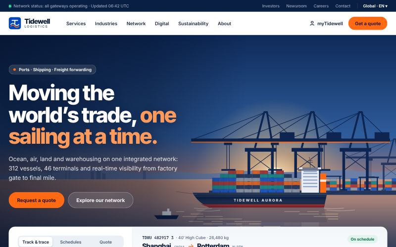
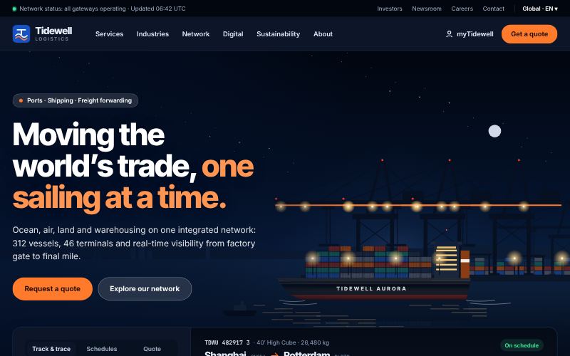
Global reach, real-time control.
For shipping and freight companies
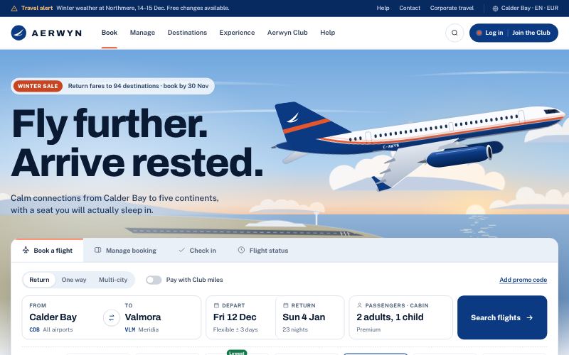
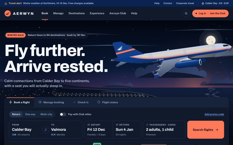
Booking-first, global, quietly premium.
For airlines and airports
For brands that sell on desire and clarity: software and hardware launches, online stores, hotels, developer platforms, agencies and premium labels.
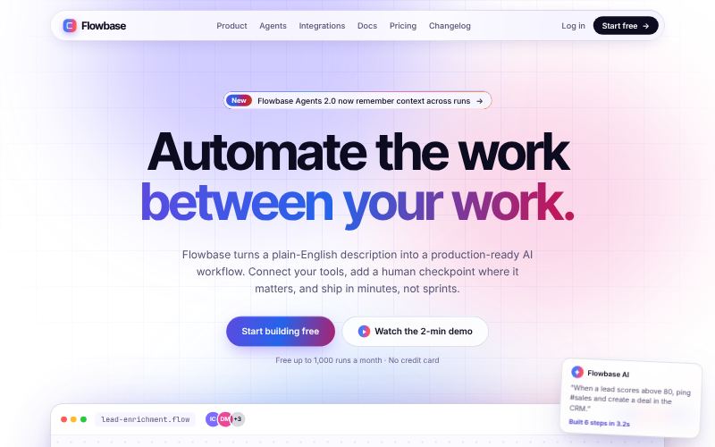
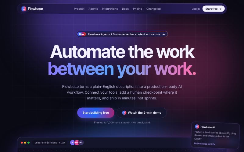
Vibrant gradients and polished product shots.
For AI and developer startups
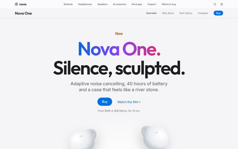
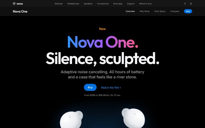
Neat tiles of varied size.
For hardware and product launches
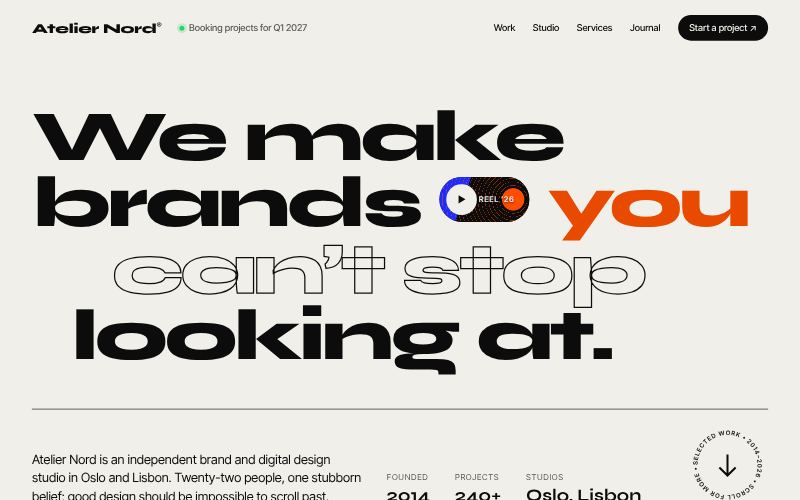
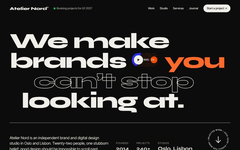
Big statements, bold case studies.
For design and branding agencies
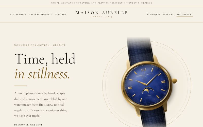
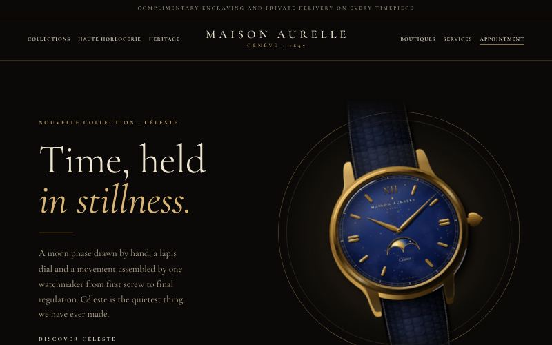
Black, gold and slow, elegant serif.
For jewellery and watches
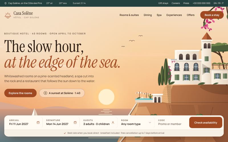
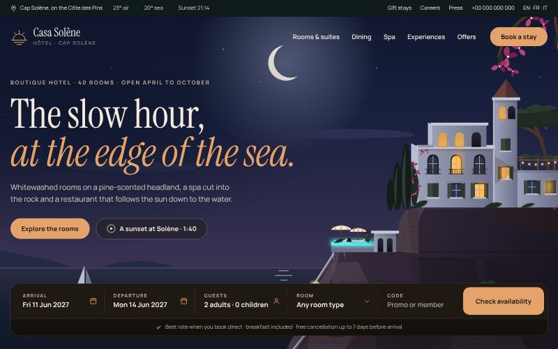
Slow, sunlit, made for booking a stay.
For hotels and resorts
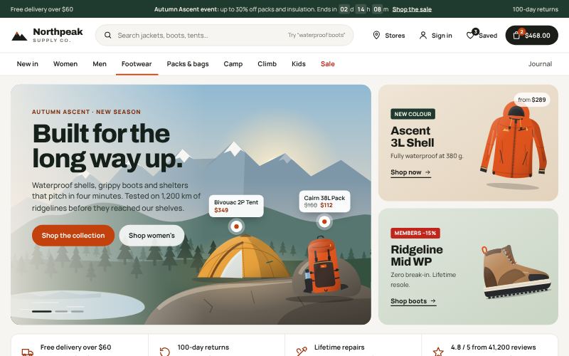
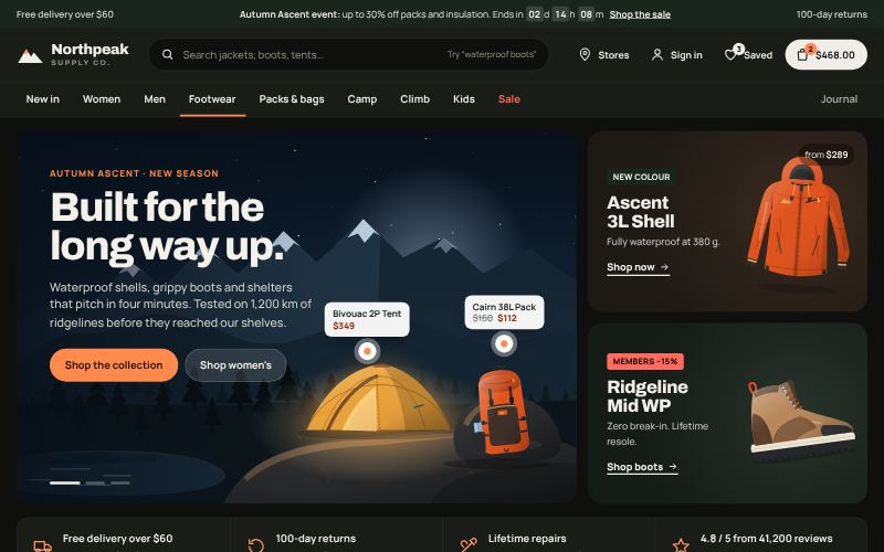
Product-first, fast to scan, built to convert.
For online shops and DTC brands
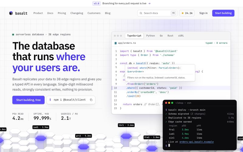
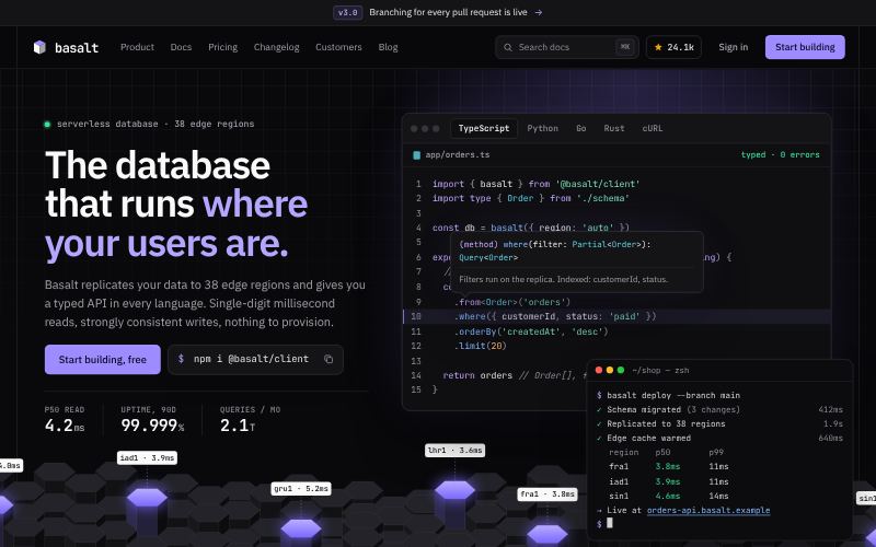
Code first, precise, quietly technical.
For APIs and developer tools
For brands whose product or writing should do the talking: restraint, whitespace and type doing nearly all of the work.
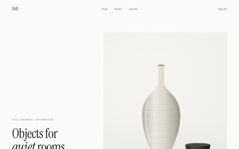
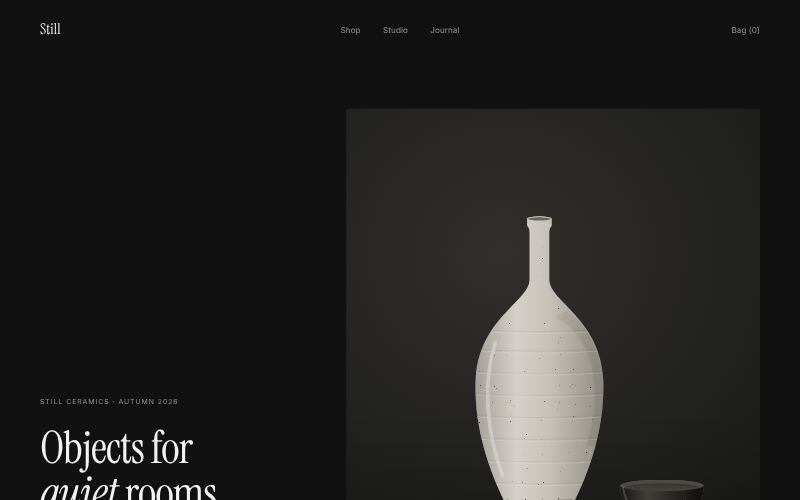
Only what matters, with room to breathe.
For premium product shops
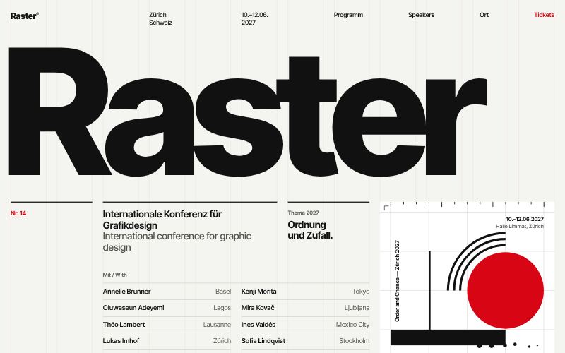
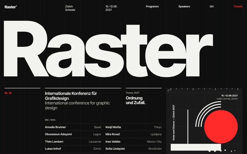
Grids, Helvetica-like type and red.
For design conferences and events
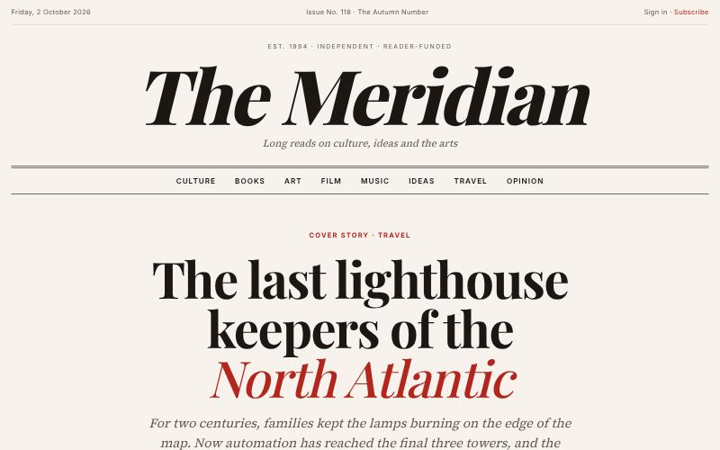
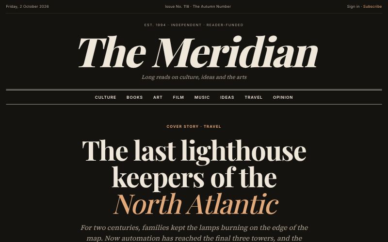
Print-magazine elegance for the web.
For magazines and journals
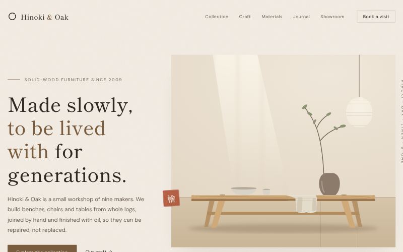
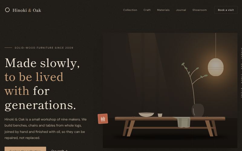
Warm, natural, quietly crafted.
For furniture and interiors
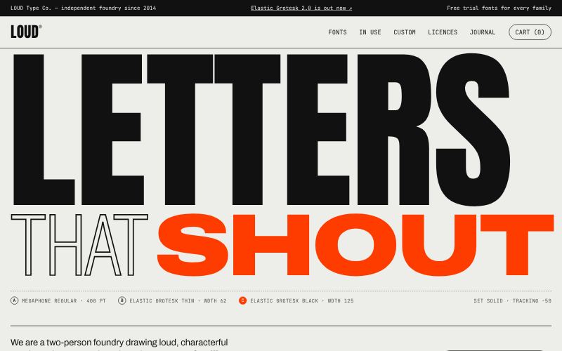
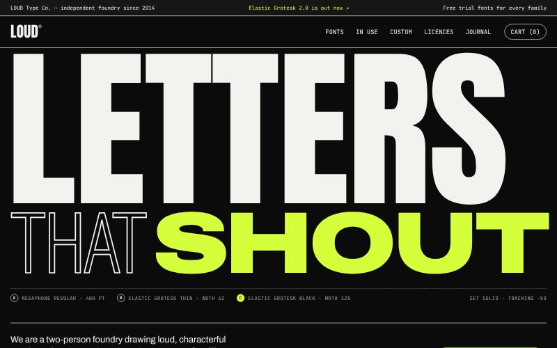
Letters as the main visual.
For type foundries and agencies
For app and device brands that want the interface itself to feel touchable: light, shadow, glass and texture.
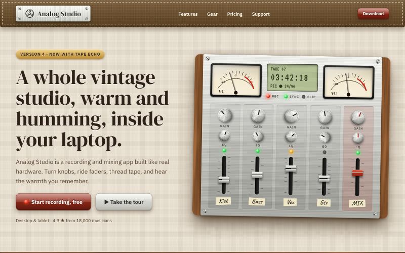
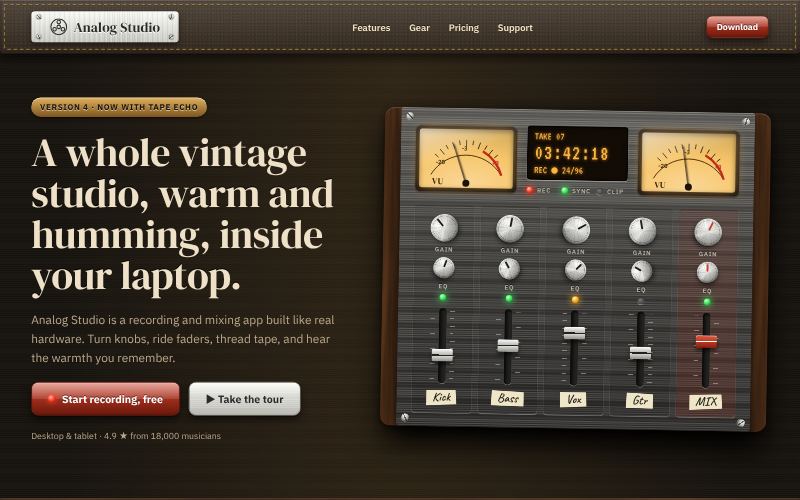
Real-world materials, rendered on screen.
For audio and music apps
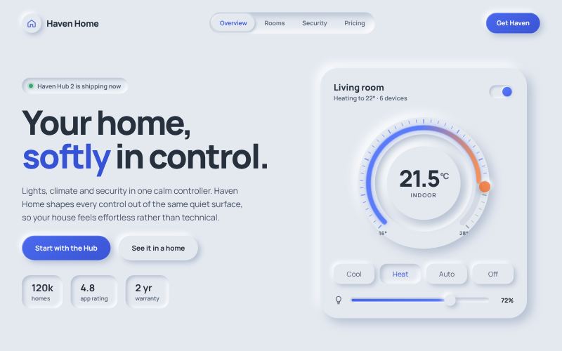
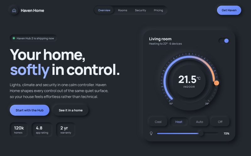
Soft, extruded shapes from a single surface.
For smart home and IoT apps
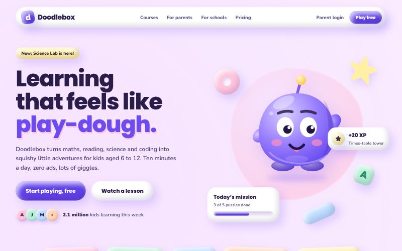
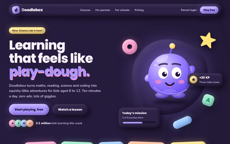
Puffy, inflated, toy-like 3D.
For kids and education apps
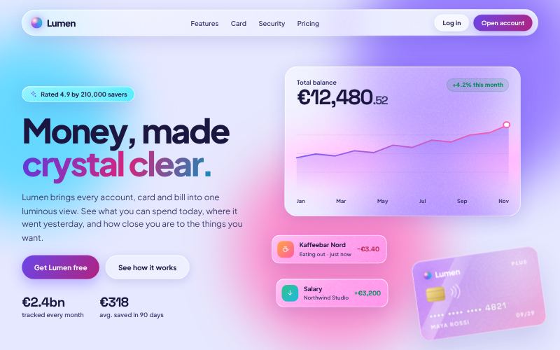
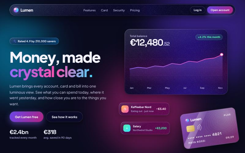
Frosted panels floating over colour.
For finance and crypto dashboards
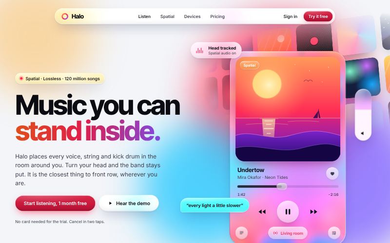
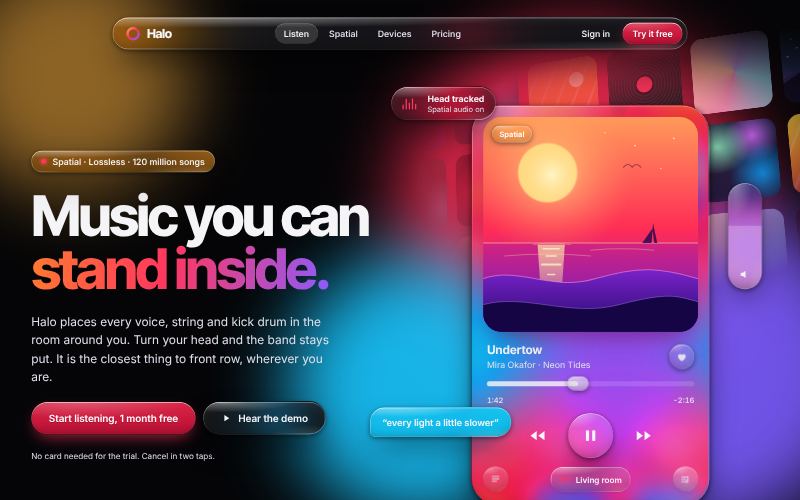
Fluid, refractive glass with specular light.
For media and streaming apps
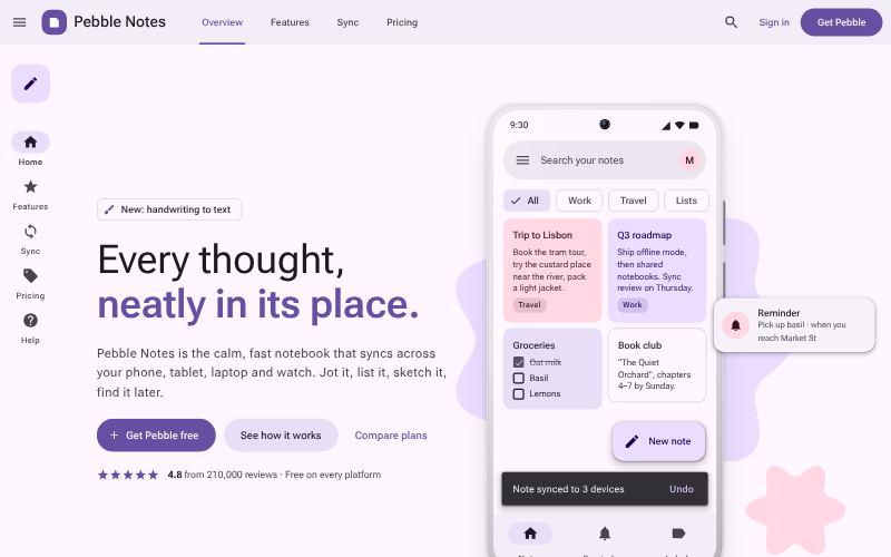
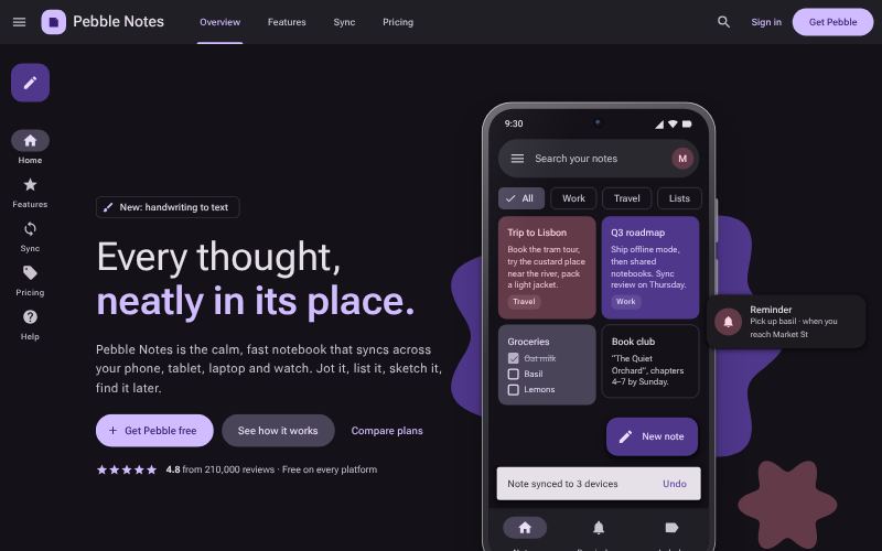
Systematic, tonal, adaptive.
For Android and cross-platform apps
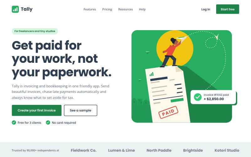
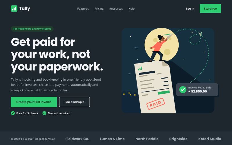
Solid colour, simple shapes, zero gloss.
For SaaS and fintech
For teams building on the frontier who want to look like it: glow, gradients and precision.
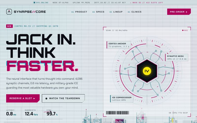
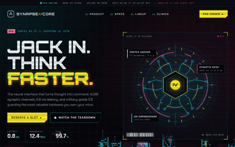
Neon, glitch and angular HUDs.
For games and esports
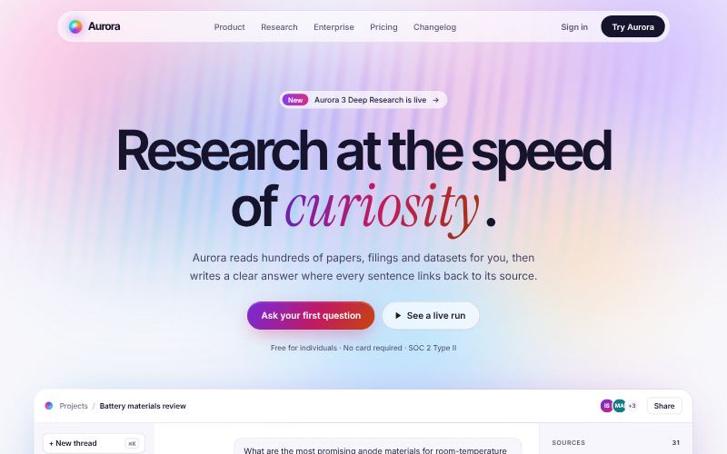
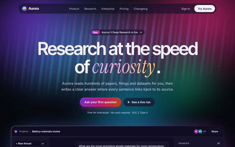
Soft glowing colour fields.
For AI products
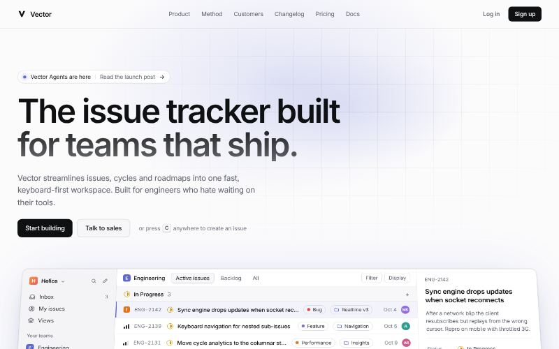
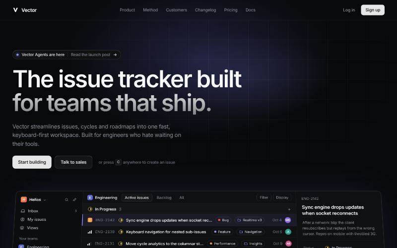
Precise, fast, quietly glowing.
For developer tools
For brands with a story or a scene to evoke: movements and eras from the 1890s through the early web, reimagined.
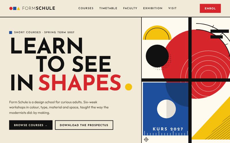
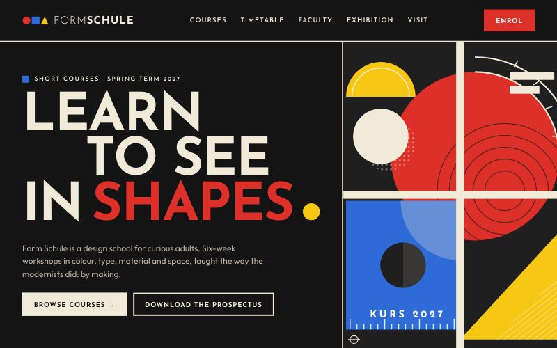
Primary colours and pure geometry.
For art schools and galleries
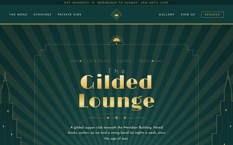
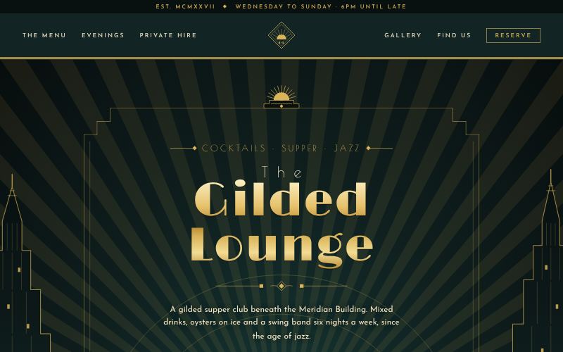
Gilded geometry from the Jazz Age.
For hotels, bars and theatres
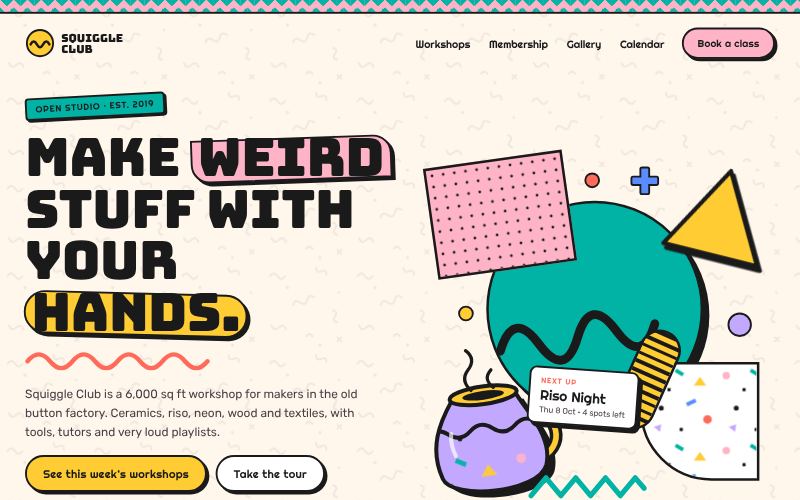
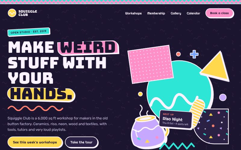
80s squiggles, confetti and clashing colour.
For kids and toy brands
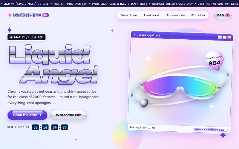
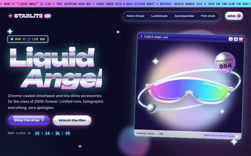
Chrome, bubbles and iridescent optimism.
For fashion and beauty
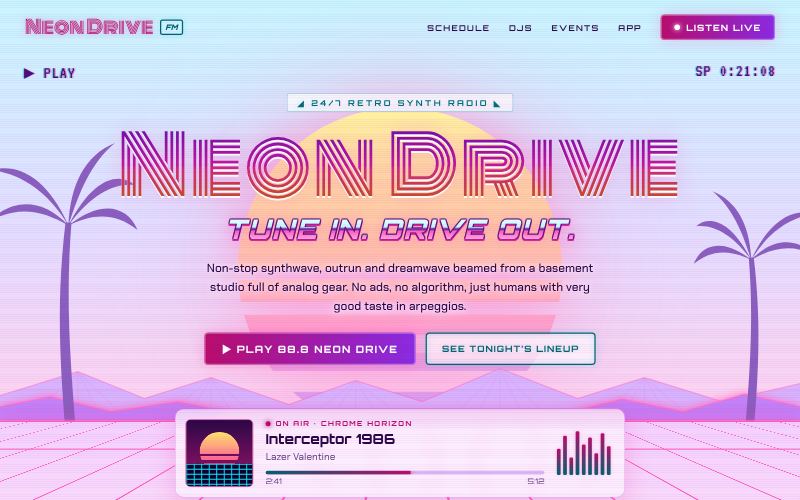
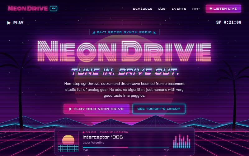
Neon sunsets over a chrome grid.
For music and radio
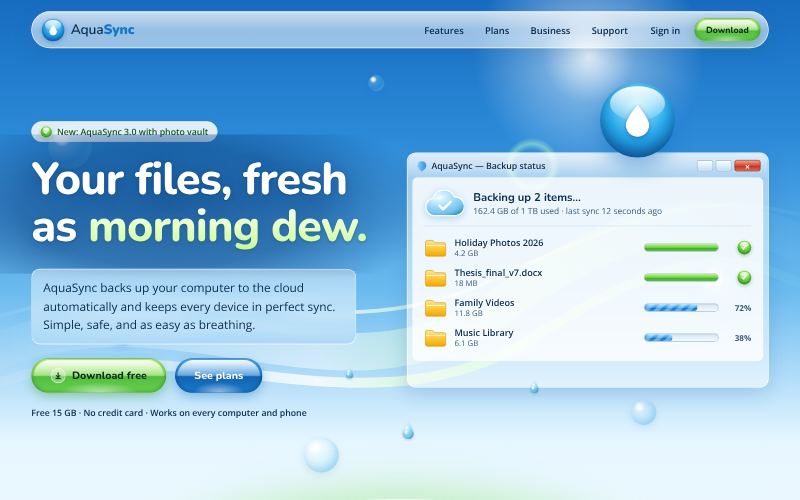
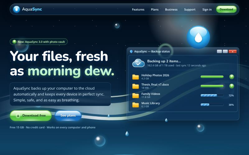
Glossy skies, bubbles and fresh green.
For utilities and cloud services


Chunky pixels and arcade nostalgia.
For indie game studios
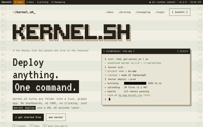
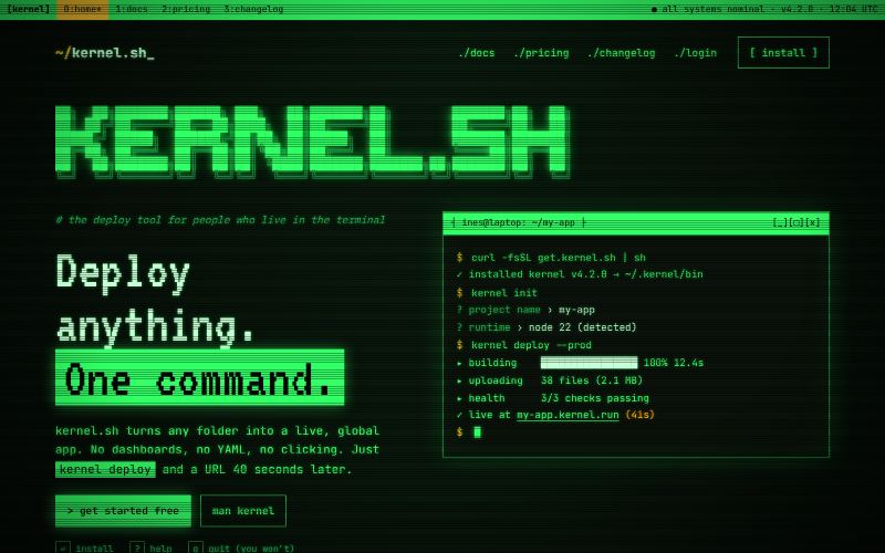
Monospace, prompts and phosphor glow.
For developer tools and CLIs
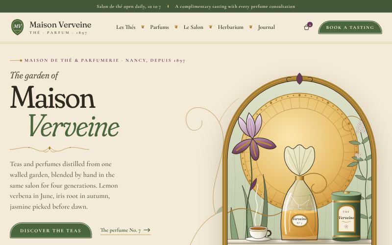
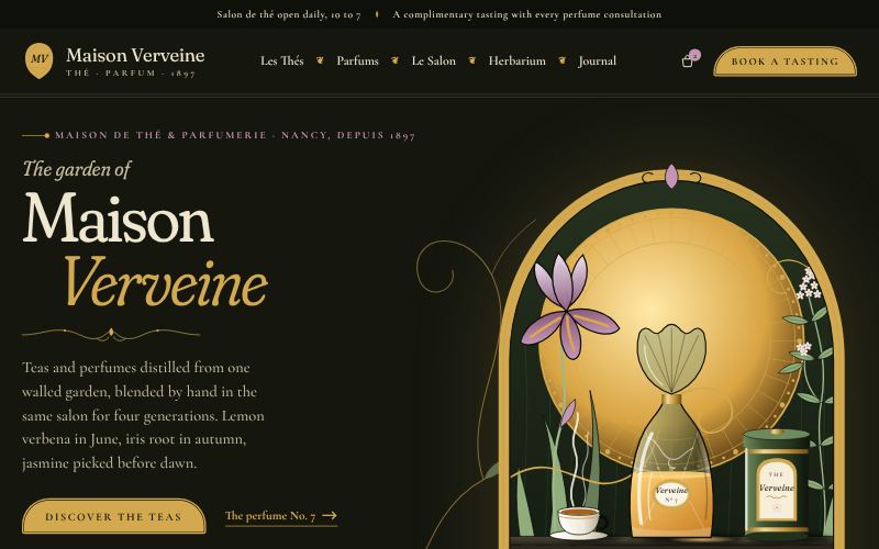
Whiplash curves, botanical ornament, gilded calm.
For tea, perfume and artisan food brands
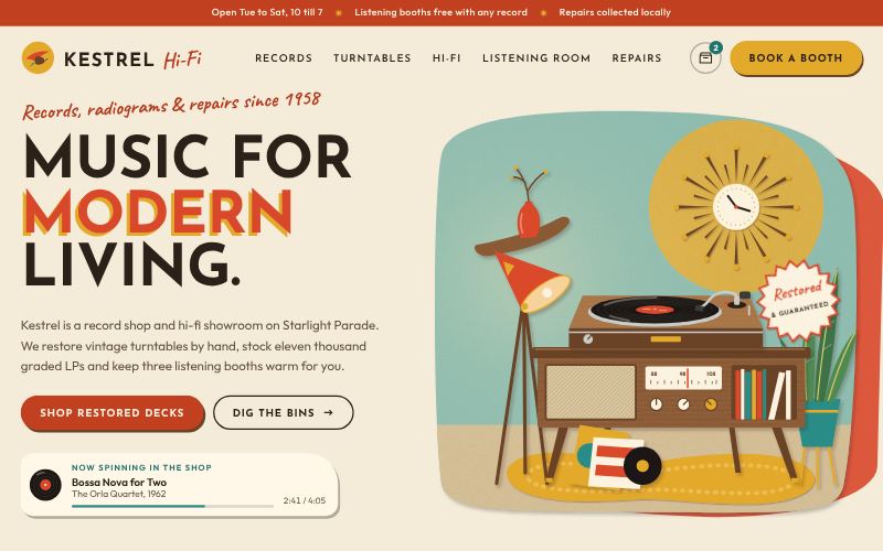
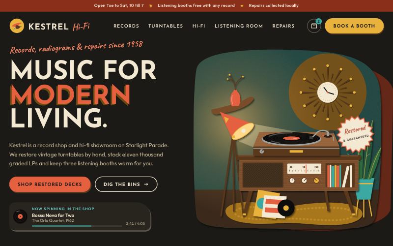
Boomerangs, starbursts and optimistic colour.
For cafés, diners and record shops
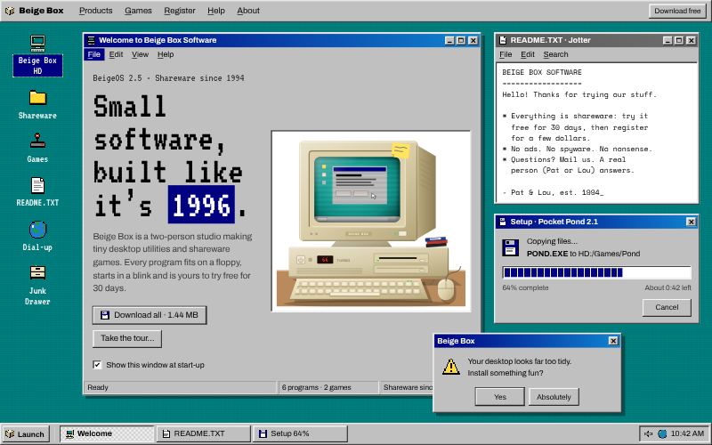
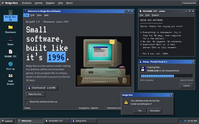
Bevelled windows, title bars and pixel icons.
For indie software and games
For small, human brands that want warmth over polish: hand-made, natural and abundant styles with lots of personality.
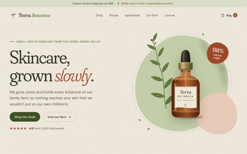
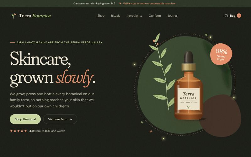
Soft blobs, earth tones and warmth.
For skincare and wellness
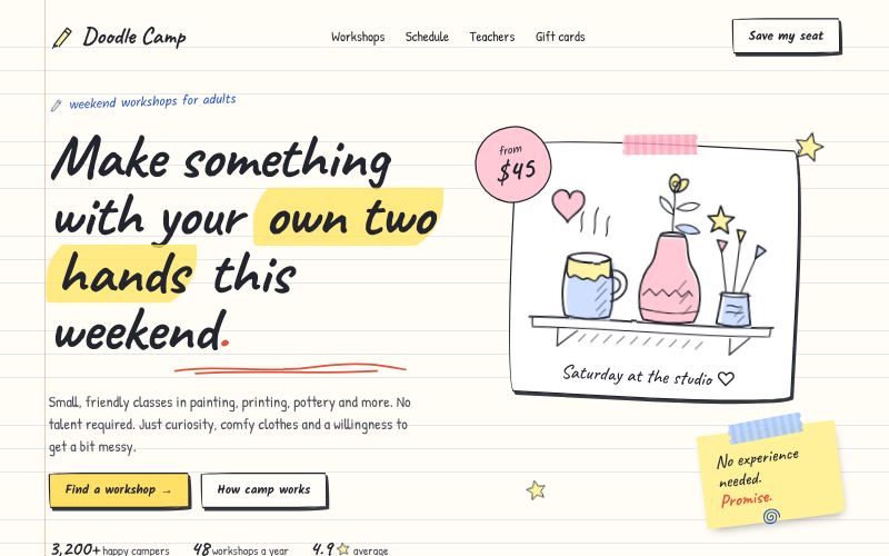
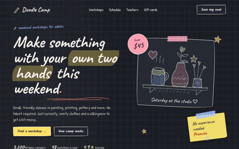
Wobbly lines and marker charm.
For education and workshops
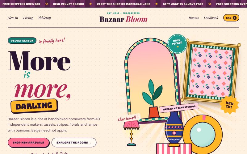
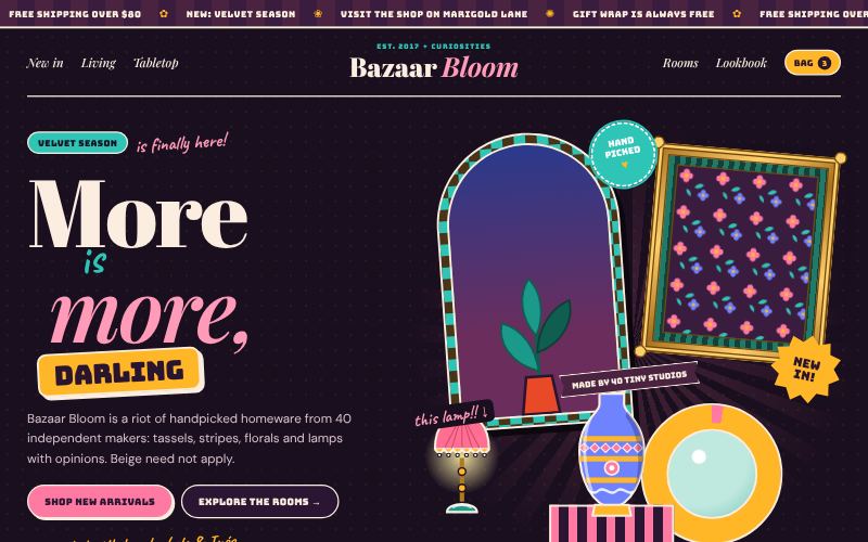
Pattern on pattern, colour on colour.
For home decor and fashion
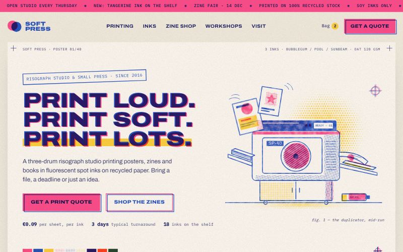
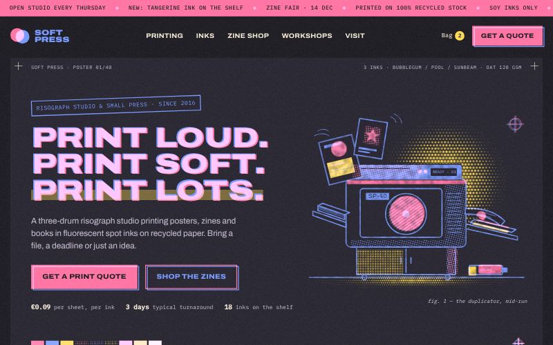
Two inks, grain and happy misregistration.
For print studios and zine publishers
For brands that would rather be remembered than liked by everyone: honest structure, heavy borders and loud contrast.
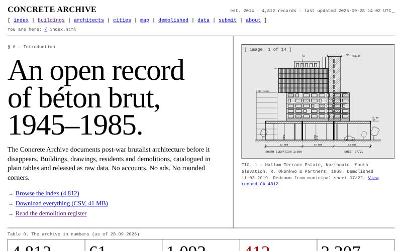
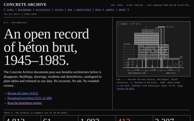
Unpolished, structural, deliberately plain.
For art and architecture archives
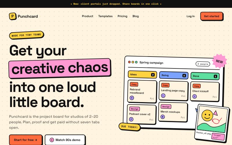
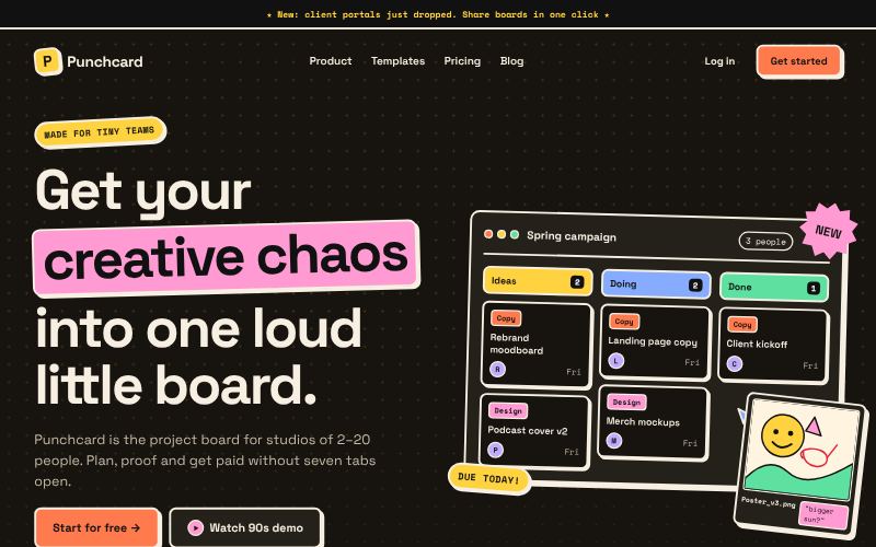
Thick outlines, hard shadows, loud colour.
For startups and creator tools
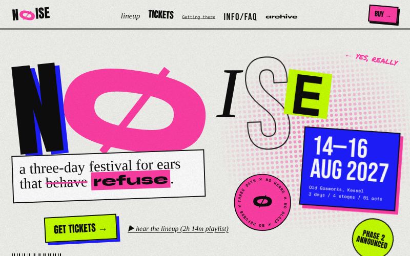
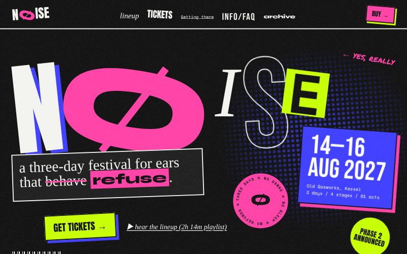
Rules broken on purpose.
For music and art festivals